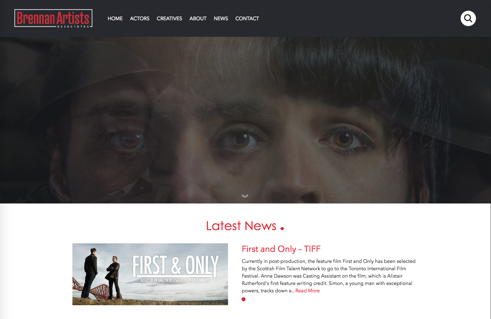
Claire and Michael at Brennan Artists had a website but it was old and built in a CMS that was quite complicated to use. They wanted something that was easy to update with news posts as getting the word out that one of their clients was in a play or a TV show quickly is important.
The artists page needed not to have any preference for a particular artist, the order needed to be different everytime someone visited it.
Easily being able to contact Brennan Artists was a must, a simple contact form would not really be enough.


It was interesting to learn about the casting process and a new creative world. It was a very fast paced environment where people sometimes needed to be available at the drop of a hat and opportunities arose quickly. From this I realised that the website had to be so simple to update and very easy for visitors to use on the front end.
Claire and Michael now have a independent section that holds all their clients, they are able to add links to Spotlight, showreels, head shots and news articles about them on one page, before they had to link and update many sections.
Users are now able to enquire about the availability of clients with form directly on the page, they no longer need to switch to a contact page or write info down to make an enquiry.
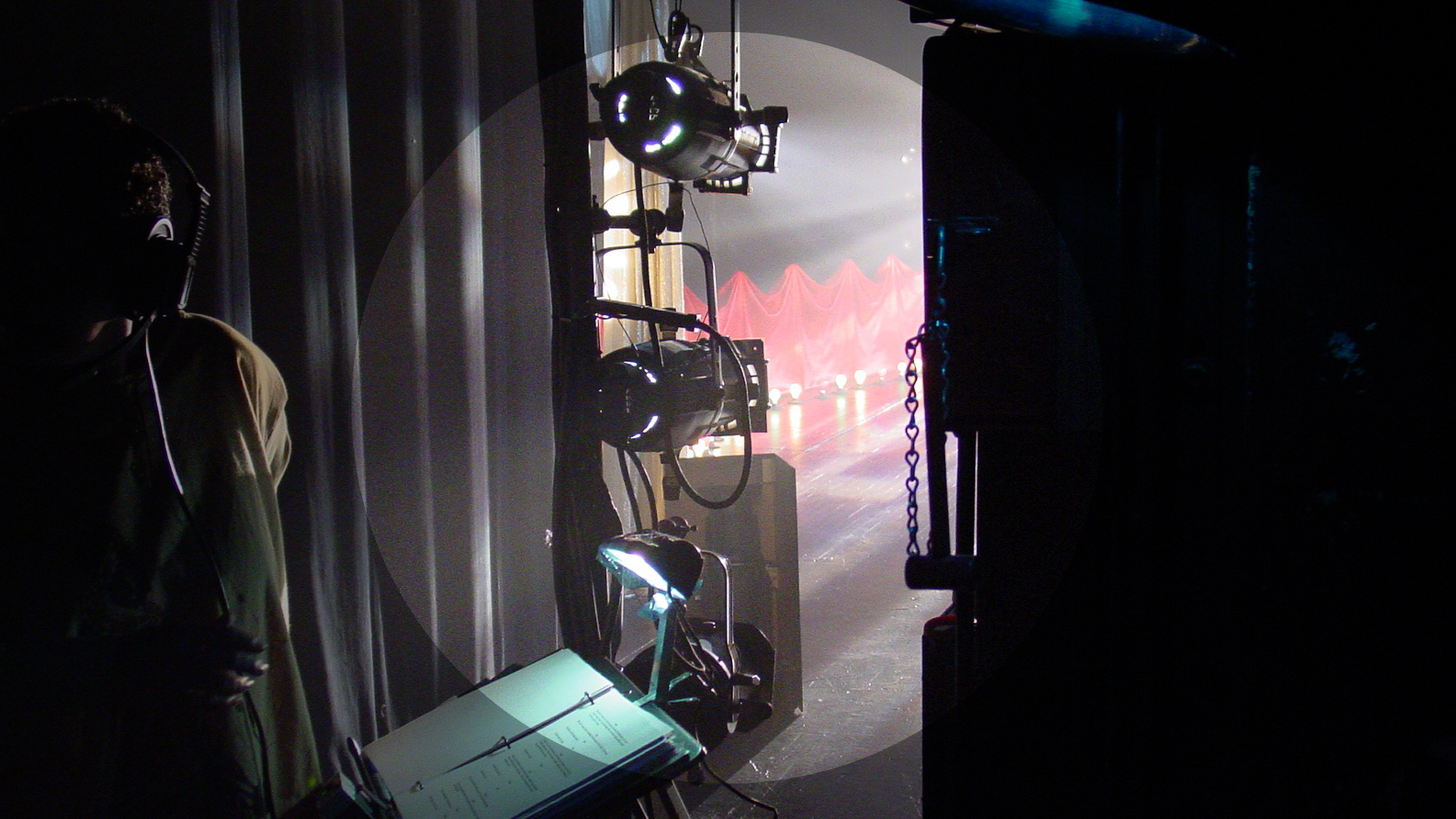
The design influence for the site were the colours for the logo that already existed and the industry standard for actors which is Spotlight (I thought it might have been IMdb). Subtely adding in the spotlight reveal on the homepage slideshow and the small red dots to accent the titles was just enough flair for this site.