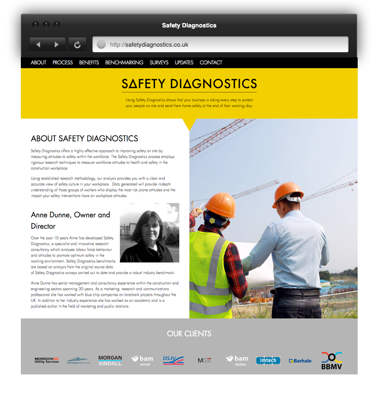
Over the past 10 years Anne has developed Safety Diagnostics, a specialist and innovative research consultancy which analyses labour force behaviour and attitudes to promote optimum safety in the working environment. She had a web presence but it was very old and tired, think websites circa 2001. She already had her logo developed by another local graphics design agency but came to us to have the website made.
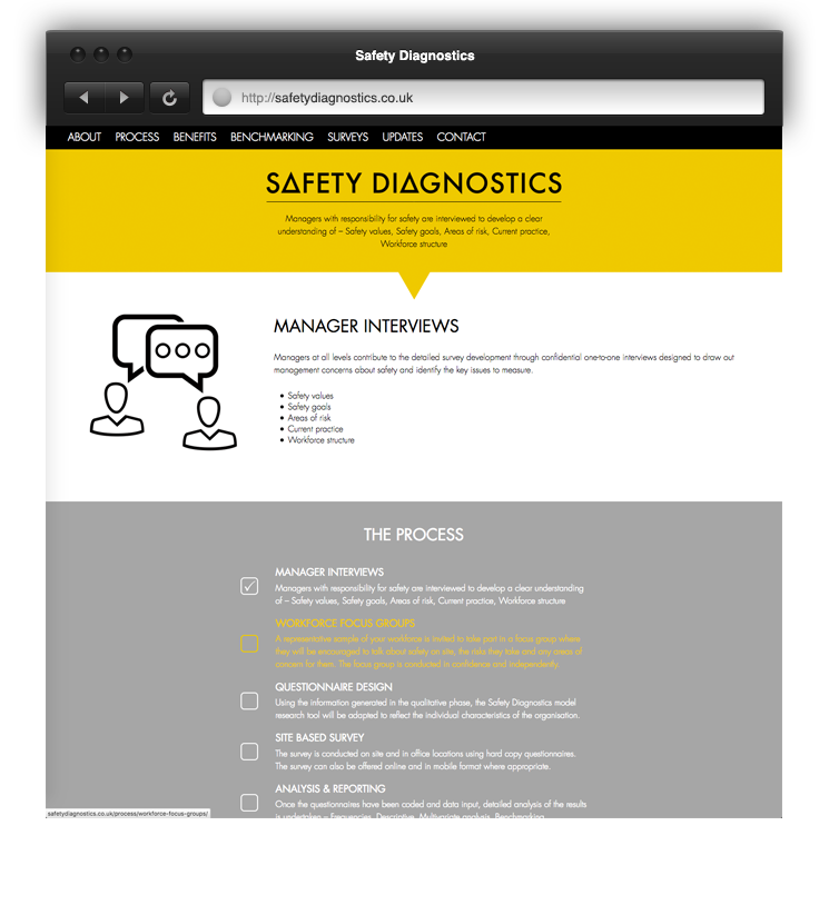
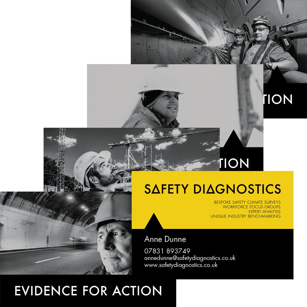
She wanted to show what made Safety Diagnostics unique by explaining the process that she undertook without giving away her secrets and create more of a brand for herself within a male dominated industry. This also included a new design for her business cards
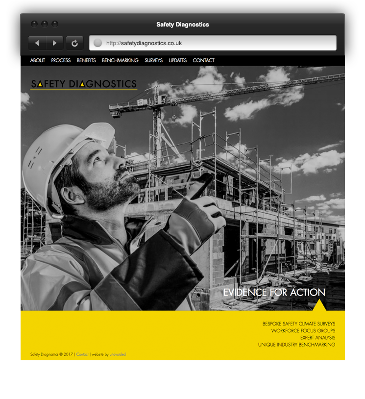
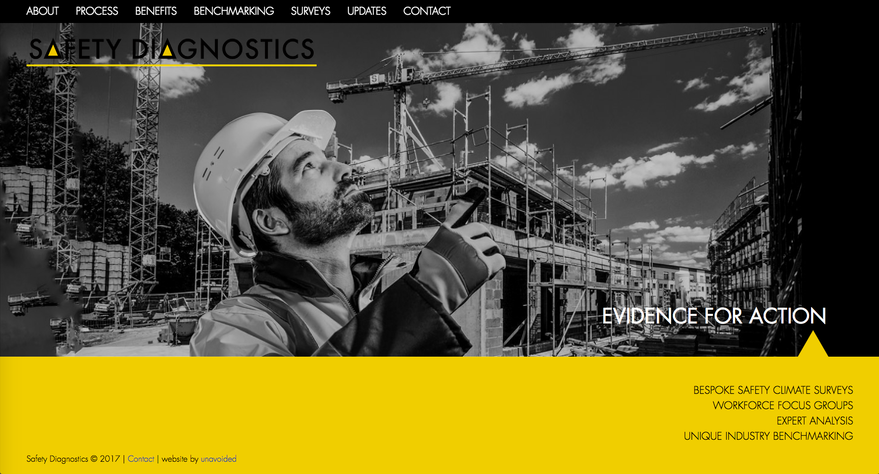
Yellow happens to be one of our favourite colours, it’s bright and exciting and when it’s used in the right context within web design it can look really good, we think and hope this was one of those times. Talking with Anne helped us create the look and feel of the overall site, she wanted it to be strong, clear and simple. The font that was used in the logo, Futura is a strong clear and simple font and helped create the look.
We found images relating to the UK construction industry on the various photo repositories and styled them up to suit the site design, a simple slideshow on the homepage created an strong introduction to Safety Diagnostics. The slideshow images were used on the back of the business cards too, creating 6 different backs on the cards.
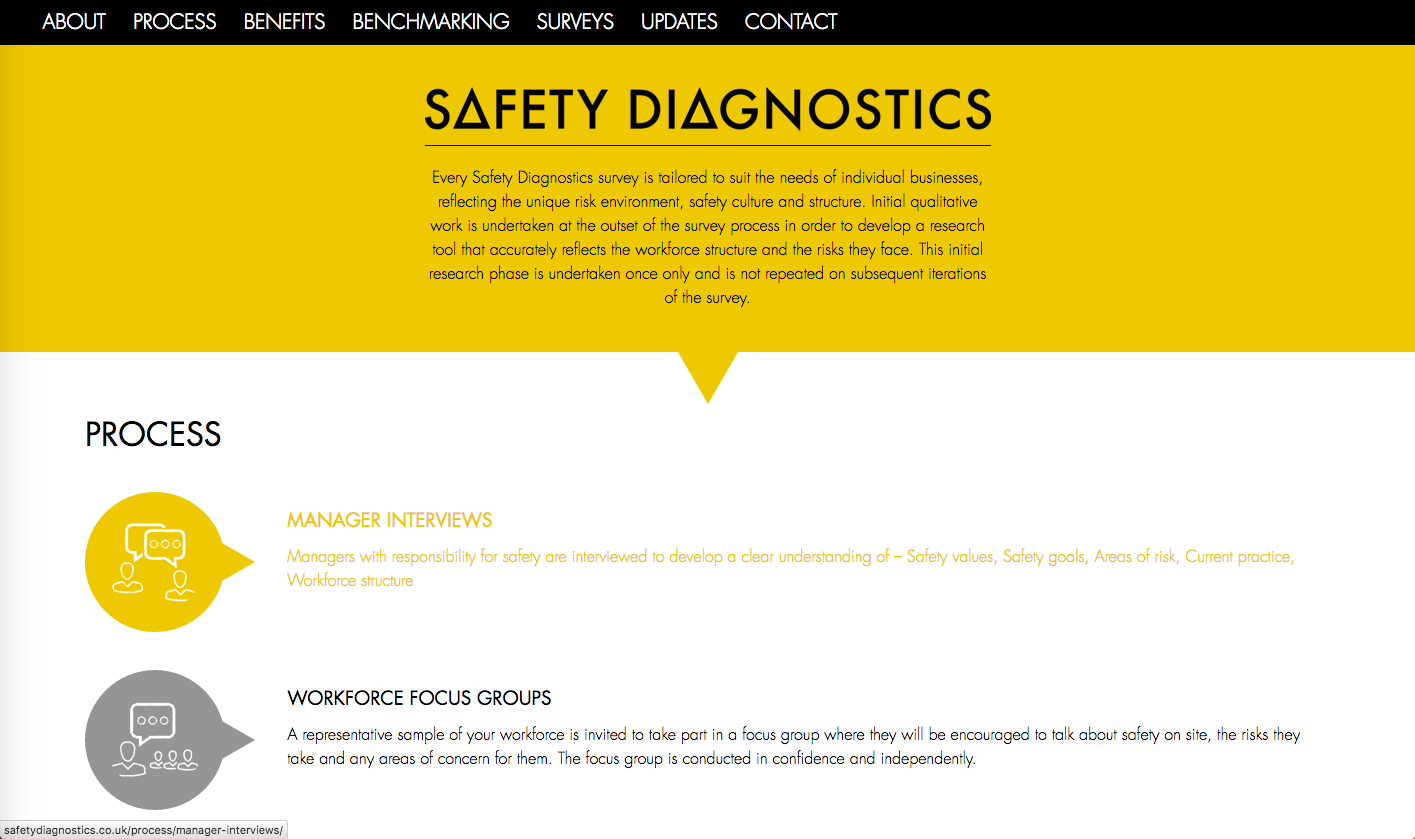
Everyone loves an icon and we incorporated relevant ones into the design rather than using images to illustrate, for example, manager interviews or workforce focus groups. It kept the design simple.
Navigation on a site is key to the user experience, we created clear pathways for the user to follow to browse the site